Brands Capitalize on Consumers Associating Colour with Wellness
Living in a Wellness-Centric World
Wellness, mental and physical, is a universal goal that has risen fiercely from the global COVID-19 pandemic. In Brazil, China, Germany, Japan, the United Kingdom, and the United States, 79% of respondents believe that wellness is important, and 42% consider it a top priority (McKinsey).

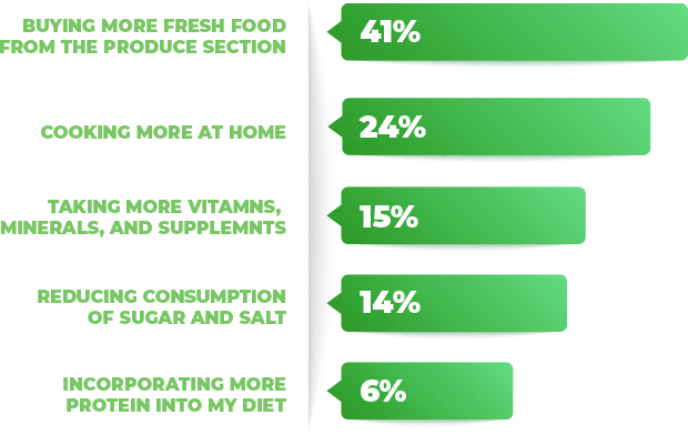
In search of well-being, with their new pandemic lens, consumers are shopping more proactively and taking a nutrition-forward approach. The meaning of “nutrition” can be very subjective, so Sensient polled U.S. consumers online in 2022 to best understand how it is understood and defined by a majority.
41% of consumers define the action of “being more nutritious” with buying more fresh food from the produce section.
Consumers Associate Colour in Products to the Hues of Vegetables and Fruits in Fresh Markets and Produce Sections
It is no surprise that brands are leveraging fresh profiles like “Red Fruits” and “Green Mango” in products outside of the produce section.
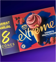
RED FRUITS
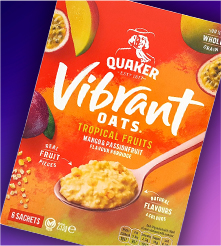
VIBRANT
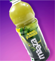
GREEN MANGO
Source: Mintel GNPD
But it is interesting to note that colour hues and descriptors are specifically being called out in the product names of some recent launches. According to multiple consumer research studies by Sensient, consumers worldwide prefer bold and vivid colour in food and drink products. Instinctively, as humans, consumers gravitate towards colour because of our ancestral cravings for nutrient-rich foods. Dating back to our days as foragers and hunters, colour in nature, whether red meat or purple wild berries, helped us identify foods that would supply our bodies with the most amount of energy. In the days of self-reliance where grocery stores and markets did not exist, food selection was a matter of survival, but those primitive truths about colour still hold true today. We still eat with our eyes first!
COLOUR IN PRODUCTS AND PRODUCT TITLES ARE VISUAL SOUNDBITES, INTUITIVELY EXCITING US.
Retailers have been capitalizing on these deep-rooted tendencies for quite some time by locating their fresh products near the entry of the store. In many cases, the produce section is what consumers first see upon store entry. This placement is not coincidental.
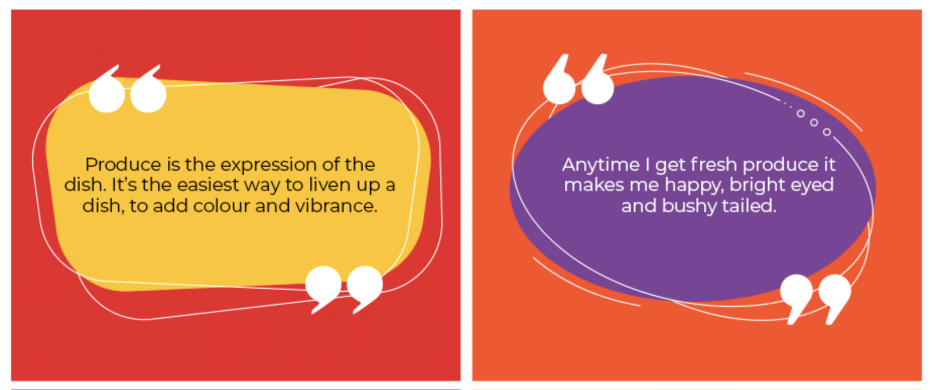
Check out a few consumer verbatims on this topic from the shopper insights section in the 2010 Retailer Study:
Retailers want to energise consumers’ shopping experience from the moment of entry by invigorating our innate excitement through the vibrant colours of nature in fruits, vegetables, and herbs.
BRANDS ARE SMART TO FLATTER CONSUMERS’ UNIVERSAL SENTIMENT FOR COLOUR.
Strategically using colour and associated words like “vibrant” in products and product names is a novel way to delight consumers instantly.
Discover some of our ideas for inspiration…
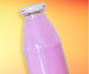
Purple Superfruit
Yogurt Smoothie
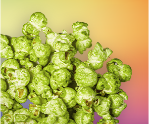
GREEN PESTO
POPCORN