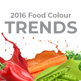
Brands Capitalize on Consumers Associating Colour with Wellness
Living in a Wellness-Centric World
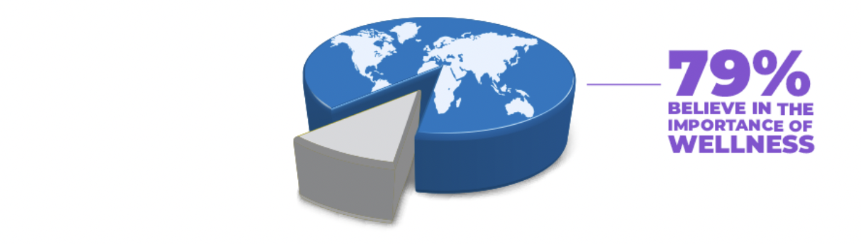
Wellness, mental and physical, is a universal goal that has risen fiercely from the global COVID-19 pandemic. In Brazil, China, Germany, Japan, the United Kingdom, and the United States, 79% of respondents believe that wellness is important, and 42% consider it a top priority (McKinsey). Wellness 360° was also identified as one of Sensient’s four key consumer trends of 2022.
In search of wellbeing sporting their new pandemic lens, consumers are shopping more proactively and taking a nutrition-forward approach. The meaning of “nutrition” can be very subjective, so Sensient polled consumers to best understand how it is understood and defined by a majority.
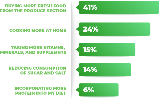
41% of consumers define the action of “being more nutritious” with buying more fresh food from the produce section.
Taking Inspiration from Nature’s Rainbow
It is no surprise that brands are leveraging fresh profiles like “Red Fruits” or “Purple Pear” and “Green Mango” in products outside of the produce section.
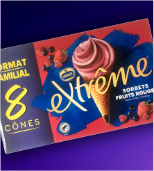
RED FRUITS
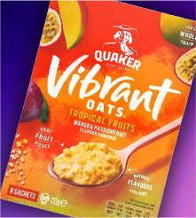
VIBRANT TROPICALS
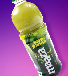
GREEN MANGO
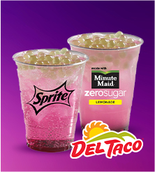
PURPLE PEAR
But—it is interesting to note that colour hues and descriptors are specifically being called out in the product names of some recent launches. According to Sensient Consumer Research, consumers worldwide prefer bold and vivid colour in food and drink products. Instinctively, as humans, consumers gravitate towards colour because of our ancestral cravings for nutrient-rich foods, dating back to our days as foragers and hunters where colour in nature whether red meat or purple wild berries helped us identify foods that would supply our bodies with the most amount of energy. In the days of self-reliance where grocery stores and markets did not exist, food selection was a matter of survival, but those primitive truths about colour still hold true today. We still eat with our eyes first!
Colour in products and product titles are visual soundbites, intuitively exciting us.
Retailers have been capitalizing on these deep-rooted tendencies for quite some time by locating their fresh products near the entry of the store. In many cases, the produce section is what consumers first see upon store entry. This placement is NOT coincidental. Retailers want to energise consumers’ shopping experience from the moment of entry by invigorating the senses with nature’s vibrant colour.
Communicating Claims with Colour
With consumers’ heightened awareness to their physical and emotional wellbeing, claims that are associated with functional benefits have been on the rise. Colour can play an important part to signal these benefits that are usually fall into the categories of immunity, energy, and mood-boosting. A vibrant orange can signal healthy doses of Vitamin C, while deeper blue and purple hues can offer a calming effect before even tasting the product. Discover some of our ideas for inspiration…
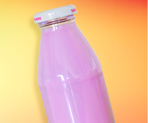
PURPLE SUPERFRUIT
YOGHURT SMOOTHIE
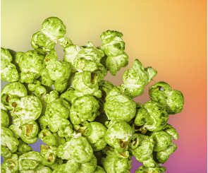
SEAWEED
FLAVOURED POPCORN
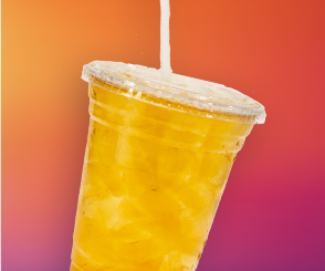
MANGO
PASSIONFRUIT MOCKTAIL
What can your brand offer in this growing arena of wellness? Speak to our experts to collaborate on new product developments today!