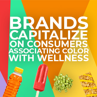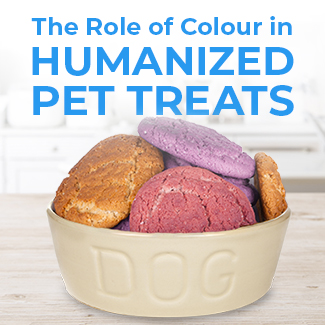
Colour’s Impact in Food and Beverages
Leveraging on Colour in Brand IdentityColour has always been a factor in brand identity, flavour amplification, and consumer recognition. From iconic coloured logos to bold hues indicating flavour, the rainbow can be a powerful tool for brands in the food and beverage industry. MTN DEW®, for example, recently launched a campaign including the tagline, “MTN DEW® doesn’t have to be green.” Recognising and harnessing the power of one of the most emblematic greens in the industry, MTN DEW® is leveraging eye-catching new colours to emphasize the flavour range of their newest collection:

Colour can be used successfully in both branding and in flavour reinforcement. From the bold red of cherry to the careful distinction between the pink of watermelon and that of raspberry lemonade, MTN DEW® is using the power of colour to improve on-shelf recognition and flavour perception of their beverages. Research shows that this is a reliable tactic.
Colour Drives Preference and Purchase Intent
“Taste” is a multi-sensory perception constructed from taste buds, visual appearance, aroma, and mouthfeel. Flavour and colour work hand-in-hand to create a product experience and win over consumers.
This phenomenon was evaluated in an academic study published in the Journal of Consumer Research using orange juice. Researchers tested consumer preference for orange juice while varying the shade using food dye or the sweetness level using added sugar. When comparing two glasses of juice, one with a brighter orange hue, consumers perceived the more colourful sample to be sweeter and more flavourful, although no actual sweetness difference existed. Conversely, when the researchers added sugar to one of two visually identical glasses of juice, those same consumers could not taste the difference.
To further this research, Sensient conducted broad consumer research of its own in order to evaluate and quantify the impact of colour alone on purchase intent and flavour perception. Beginning with online-only testing of 600 consumers, a variety of products spanning the food and beverage industry were used to identify market-wide trends.

Each category user surveyed viewed a concept statement paired with a single image. The image showed either a colourful, vibrant product or the same product in a low-colour or colourless version. The concept statements each included references to natural ingredients and remained identical regardless of the colour shown in the image. They then responded to a series of attribute questions, rating their perception of the product’s sweetness, naturalness, flavour, health, and overall appeal. They also rated their likelihood of purchasing the product.
CONSUMERS SHOWED A PREFERENCE FOR THE HIGHER COLOURED PRODUCT IN 86% OF PRODUCTS TESTED.
(Sensient Consumer Research, 2017)
High colour products were consistently perceived as more visually appealing. In side-by-side testing that more closely mimicked the in-store purchase experience, data showed that colour impacts trial rates. Consumers in the study offered verbatims identifying the higher colour products as appearing more flavourful, tastier, sweeter, and more representative of the touted flavour profiles. Lower colour options received comments like “bland”, “tasteless”, and “not matching the description.” High colour images outscored low colour images because of their perceived association of better taste expectations.
The Bottom LineNot only did consumers like the more colourful products better, but they also indicated that they were more likely to purchase more colourful food and beverages.
purchase intent scores
+6% ACROSS
CATEGORIES

For example, a colourless energy drink currently on the market generated $71.8 million in dollar sales for the 52 weeks ending 10/3/21. The same product could offer that brand an additional $4.23 million in dollar sales annually if a flavor-appropriate color was used. Don’t leave money on the table by skipping color.
To See Is to TasteColour can not only affect purchase intent and trial rates, but also flavour perception. Sensient’s research continued with a study evaluating the quantifiable impact of colour on flavour perception with in-person sensory testing. Sensory testing data aligned with the results of the online testing, with optimised colour generating increased purchase intent and increased overall liking scores over low colour alternatives. Most interestingly, while flavour remained constant and only the colour changed between two otherwise identical products, optimised colour increased flavour perception scores by an average +14.7% across categories.

For example, a raspberry flavoured cookie baked with two different beet colour solutions garnered substantially different flavour expectation scores. The cookie using standard beet juice lost much of its red hue in the baking process, while the same cookie baked with Sensient’s heat-stable beet technology, SupraRed™, remained a bold raspberry red shade. Although no actual taste difference existed, the more brightly coloured cookie was rated 23% higher for flavour than its lower colour companion by consumers tasting the product. This data shows the impact of colour alone on consumer perception of taste matching the expected flavour.
Overall, colour’s impact on purchase intent, flavour perception, and overall liking has consistently been found to be statistically significant. Brands looking to impress shoppers should not overlook this key component, as vibrantly coloured products are better liked and more likely to be purchased by consumers.
Let Sensient’s team of experts help you delight consumers with bright, delicious products. Request a sample or a consultation to get started today!